🧠 Why Great Logo Design Matters — And a Look Inside Our Latest Math Tutor Logo
At Red Bearded Marketing, we believe that a well-designed logo does more than just look good — it communicates. It tells your audience who you are, what you value, and why they should trust you — all in a single glance.
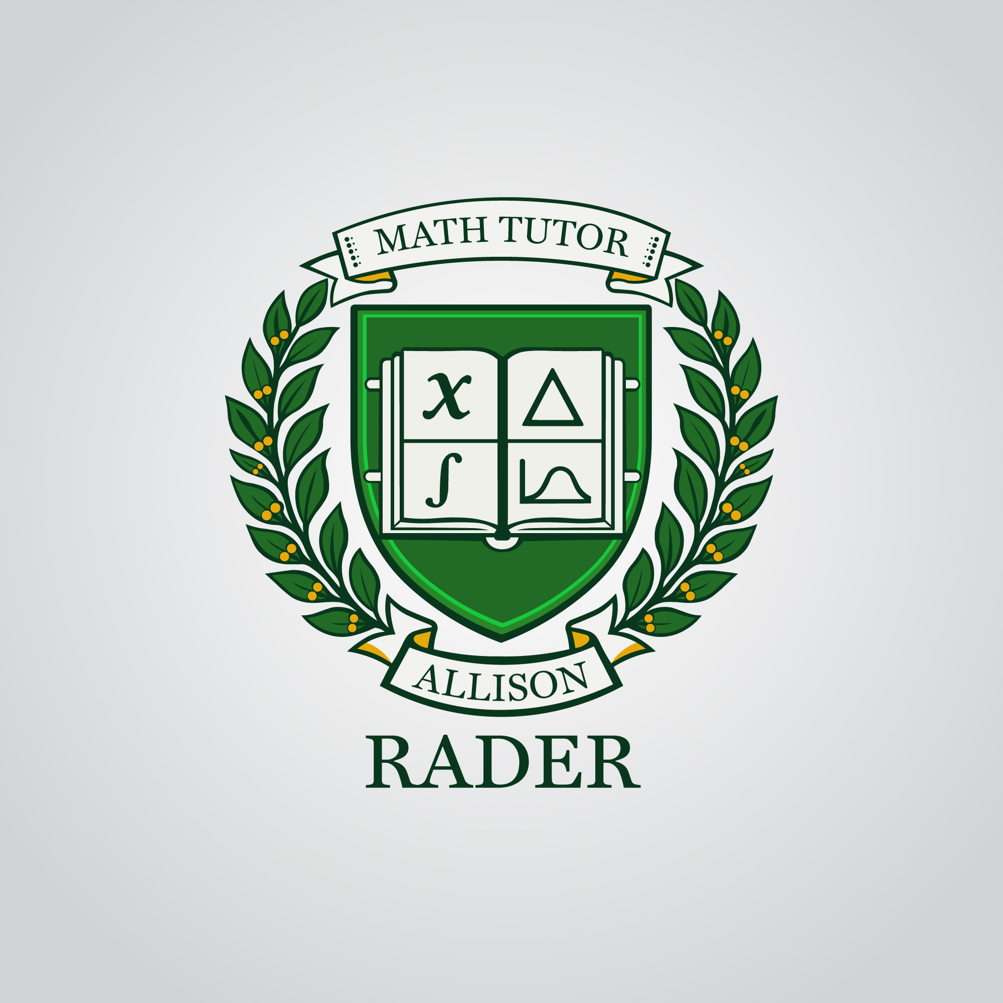
Recently, we had the pleasure of designing a custom logo for a Math Tutor whose professional website we’re currently building. This project was a great reminder of how thoughtful design can turn a simple concept into a brand asset that connects with your audience.
🎯 What Makes a Great Logo?
Before we dig into the Math Tutor logo, let’s talk about what makes a logo effective:
Simplicity — A clean, uncluttered design ensures your logo is instantly recognizable.
Relevance — It needs to reflect your industry, personality, and audience.
Memorability — A great logo sticks in the viewer’s mind.
Versatility — Your logo should look as good on a business card as it does on a website or social media.
Timelessness — Design trends come and go. A great logo endures.
At Red Bearded Marketing, we create logos with all of these principles in mind — and tailor them to each client’s unique brand.
📐 Behind the Scenes: The Math Tutor Logo
Designing a logo for someone who teaches math presented a fun and meaningful challenge: how do we visually express clarity, precision, and approachability?
Here’s how we approached it:
➕ 1. Symbolism with Purpose
The final logo integrates a stylized mathematical symbol that feels friendly rather than intimidating — turning something students often fear into an inviting visual anchor. These elements are:
Geometric shapes that suggest structure and logic.
A subtle plus sign that doubles as a symbol of positivity and progress (just like tutoring should feel).
Clean lines to evoke clarity and confidence.
🎨 2. A Thoughtful Color Palette
Colors aren’t just decoration — they set tone and emotion.
Blue was chosen as the dominant color for its associations with trust, intelligence, and professionalism.
A pop of energetic accent color brings warmth and personality, making this brand feel approachable for students of all ages.
🔤 3. Typography That Speaks to the Audience
A modern, sans-serif font keeps the logo readable at any size — and reinforces that this is a forward-thinking educator, not a dusty textbook.
💡 Why This Matters for Branding
For the Math Tutor client, this logo isn’t just a pretty image — it’s the visual foundation of their entire online presence. It sets expectations for professionalism, trustworthiness, and a positive learning experience — all before a potential student ever clicks through to the website.
As we build out their site, the logo guides:
✅ Color choices
✅ Header styles
✅ Marketing materials
✅ Social profiles
✅ Business cards
…and ultimately creates a consistent, cohesive brand.
✍️ Our Logo Design Process
Here’s how we typically tackle a custom logo project:
Discovery Call — We learn about your business, audience, and goals.
Research & Moodboarding — What works in your industry? What can we do differently?
Concept Sketches — Multiple directions, not just one.
Digital Drafts — Vector designs you can use anywhere.
Client Review & Refinement — Collaborate until it feels perfect.
Final Delivery — Logo files in all formats you’ll ever need.
Every step is designed to ensure the logo isn’t just creative — it’s effective.
🛠️ Need a Logo That Works for You?
Whether you’re launching a new business or refreshing your brand, a great logo is worth more than you think — it’s an investment in your identity.
📩 Contact us or schedule a free consultation — we’d love to bring your brand to life.


